The 1170 pixel Grid System
The Grid System
Ever wonder why a lot of websites seem to look the same? Why they might have that “templated” feel? Are you turned off from that? I know I am.
As a designer and creative type, you can imagine how mortified I was when I realized I had to design within the scope of a “grid system.” I was used to just putting things where I saw fit, where the flow of the design took me, now I am being confined to these specific “spans” and I have to do math?! Gross.
Although I may have rebelled a bit in the beginning, I really had no other option than to conform (unless I wanted to get yelled at constantly by my developer or have my design be less than I imagined because what I envisioned, just wasn’t possible).
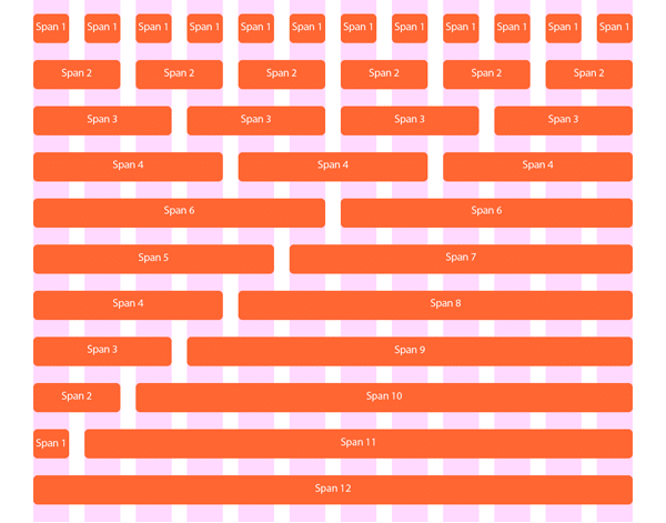
So, the grid system, what is it? It is a basic lay out of different spans that in a nutshell, tell me where and where I can not design. As you will see from the image, there are a series of 12 spans, and within the spans, they all must add up to the number 12. Span 6 matches with Span 6, Span 4 would match up with Span 8 etc. The grid offers structure to develop a clean, visual path in web design.
 Why do we need it?
Grids offer an effective system of site layout to effectively communicate a website’s message clearly to the end user. They also make the life of the developer easier because it allows them to update the layout of a site in a very clear, concise way. It is imperative in today’s world of the “responsive design” as well. Using the grid system allows you to take out specific spans as you size down to tablets or mobile phones so that the look and feel of your site stays the same, it just takes out the fluffy stuff as you view it on smaller devices. It also proportions the spans based on percentages ensuring proper sizing for different screen resolutions. You can see on our website, if you shrink the size of your internet window, it’ll adjust proportionately.
Fear not, although using the grid system confines you to boundaries, there is a means of escaping them, and I’m really good at it when it comes to web design! Contact us today if you’re in need of a website that follows all of today’s web standards, looks great and effectively conveys your company’s message. For those of you who do web design, you are welcome to download the .ai version of my grid layout.
0 COMMENTS


