Our 3rd Website Redesign
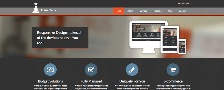
We recently decided to redesign our website… for the 3rd time. Some might call us crazy, others might think we’re confused, still others might say we have nothing better to do. Really, it was for a variety of reasons, so I’ll explain.
We Need to Stay On Top of the Trends
Not sure if you noticed, but the technology world seems to change by the minute. Part of our job as a good Web Design Company is to stay on top of the trends. In saying that, we really like the look of flat design. The concept of flat design actually isn’t new, but it has made a comeback for many reasons. We find it congruent with our company ideals; it is effective, simple and direct. Plus it works great for responsive design.
Our Business Model
As a company that is only a year and a half old, we’re still kind of a baby (although, we have exited Start-Up phase and have entered the Growth phase). The Growth phase is where you really refine your market niche and establish your track record. We’ve done that since our last website (ie: our packaged solutions and our portfolio is really starting to blossom)!
Better Portfolio
Speaking of our portfolio, we’ve got some websites under our belt that we are really proud of. What we realized through our last website is that we weren’t really highlighting all of our capabilities through our portfolio. In our redesign, we used some great imagery, really spelled out the individualities of each site and gave the easy to reference specs of the services each project entailed.
Blog Commitment
I’m not gonna lie, up until recently we weren’t the greatest bloggers. It was one of the items we focused on when “we had nothing else to do.” We were setting a bad example to our clients by doing that. So, in committing to a blog each week, we wanted a better layout to go with it. Again, we used big imagery, included authorship at the bottom of each post and made it easier to access our most recent posts to encourage more readership.
Our Website Is Our Best Form Of Marketing
Simply put, we build websites as our job- if ours stinks, why would anyone buy from us. (Not that our last website stunk, but it was time for an upgrade).
Request For Services
On our last site we got quite a few “cold” inquiries- people found us, filled out our quick form which asked for name, phone, email and a message. Most of the time we got a name and an email, which didn’t allow us to understand their needs or even who they were before we made contact. Our new Request For Services page really pinpoints some of the things we need to know in order to have a more effective first correspondence.
So, going back to my first statement, maybe we are a little bit crazy for designing for a 3rd time, I call it striving to be better. And maybe we were a little bit confused about our business model, but what business isn’t in the first years? We are really defining our model now, and I’m excited about that advancement. As far as not having anything better to do, that’s just not the case. We’re always working behind the scenes to better our client’s experiences and just be a better business.


